

Tuesday, December 24, 2013
Tuesday, December 10, 2013
Nelson Mandela had STYLE.

To read more in depth about the philosophy behind his style choices, here is a great article in GQ about The Madiba Shirt.


Monday, November 4, 2013
The Art of Hermes. Right in my own backyard.
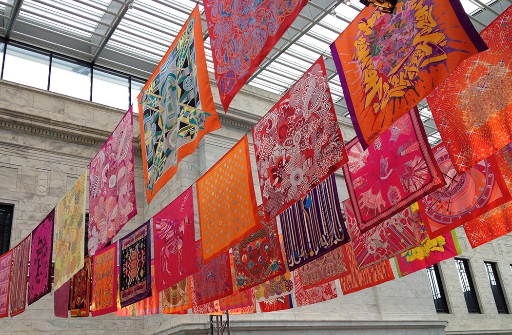
Anyone who knows me, knows what a scarf addict I am. So when I heard that Cleveland Museum of Art was hosting a presentation on how Hermes make the Hermes scarves, I couldn't miss it. Plus, any excuse to head over to the museum, which if you have never visited–you should–it is absolutely WORLD CLASS. This event is a perfect example. I wasn't sure what to expect – would it be a slide show or video with a narrator? I was amazed to discover that, in fact, actual artisans form Hermes, master printers, as they referred to them, presented a hands-on demonstration of the silk screen process right there in the Atrium. It was a very interesting "show" with lots of inside scoop on the culture over at Hermes and how their standard of excellence drives every detail. Quite inspiring. I know Hermes is a luxury brand, but I had no idea that each scarf is literally made by hand, each color of ink silk screened with precision. A very informative, entertaining and inspiring presentation.
You can read lots more about the details of the process at Cleveland.com.
 |
| Henri lines up the screen, using his 26 years of experience to "eye it up" |
 |
| A screen for every color, plus one solely to print the Hermes name and copyright. |
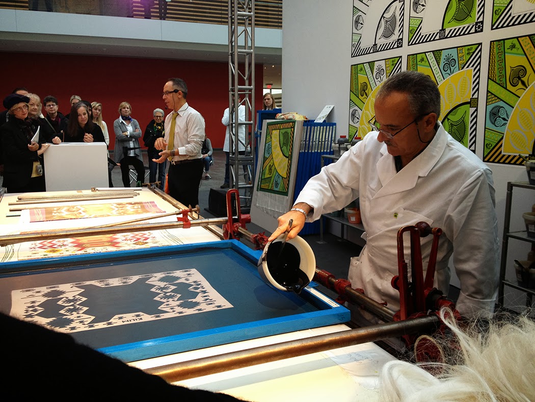 |
| Of course, they make their own inks in the "kitchen" in Lyon. |
 |
| Good thing they weren't giving away any scarves, I would not have been able to choose! |
Wednesday, September 25, 2013
Cathy Hunt Designs Available at OfficeMax

 I am doing a little dance in my office right now. On the shelf at OfficeMax you can find file folders with Cathy Hunt designs printed on them—twelve designs, to be exact. This is a bit of a milestone for me. One of my goals this year was to be "on the shelf" so I am pretty excited to be in a national retailer like OfficeMax. Now I need to get some filing done...
View more of my work at cathyhuntstudio.net
 |
| from the Garden Gate Collection |
 |
| from the Wellington Court Collection |
Friday, September 6, 2013
Great Lakes Brewing Company 25th Anniversary
| The GLBC logo I designed 25 years ago has not changed a bit. |
| Yes, we'll be celebrating with a few of these... |
 |
| Tim and I in Rome schmoozing the local proprietors. |
To get the full story on GLBC, read more here. Or better yet, stop by the brewery on Market Avenue, where it all started. I'll be down there today enjoying a few really great beers, great atmosphere, and a lot of history.
Tuesday, April 16, 2013
In a Waverly World...
 Well, if I had my way I would live in a Waverly World. This campaign has been around for a while but each new ad always makes me chuckle. Every inch of the world should be so beautiful. Thanks, Waverly, for the inspiration.

Saturday, March 30, 2013

Monday, February 25, 2013
What inspires you?


What inspires me? Re-branding, typography and pattern design all in one ad is kind of hard for me to resist. This ad in Fast Company actually splits the magazine in half, turning the orientation upside down in either direction. (Well, you have to see it to know what I mean, but it is a cool media buy if you like that kind of stuff, which I do!) The advertiser: Lincoln Motor Company. (Hmm, sounds familiar, do I know them?)
Thursday, February 14, 2013

Monday, January 21, 2013
Pantone Color of the Year 2013: Emerald Green


I was not surprised to see this green as Pantone Color of the Year. I feel like versions of it have been appearing on my radar for a while now. I have been playing with different ways to use Emerald 2013. One of the things I love about this color is its versatility. It can be the hero of a palette or a great grounding color for some brighter companions. The blueish-green version, almost a teal, is where I see this color going in the next couple years. I was shopping in Target and just could not resist these towels. Brave of them to mix the yellow-green with the teal, but I think it works beautifully.
Monday, January 14, 2013
Twitter Art Exhibit


Subscribe to:
Posts (Atom)