Monday, February 22, 2010

Transmoflection. Vancouver 2010 Graphic Identity.

Transmoflection. Transformation, fusion, motion, reflection, connection....these are the words used to describe the essence of the Vancouver 2010 Graphic Identity. I have been enjoying the backdrops at the events, the green, blue shapes, swirls and textures that are the core graphics and a visual part of each event. The process they used to get there seems intuitive, yet smart. I love the end result. Very unified. Strong identity, which of course is the point, but not something that has stood out to me in past Olympics.
Watch the design team talk about how they got there.

Sunday, February 14, 2010

i heart pink!

Just one of the things I love about Valentine's Day.

Saturday, February 13, 2010

GO WORLD.


2010 Winter Olympics in Vancouver. I am already glued to the competitions. But even more than the events, I enjoy the dramatic back stories, the lush scenery, better than going to the movies! And the commercials! Who needs the Super Bowl? So far, Visa, Coke and Nike spots have grabbed me.

Monday, February 1, 2010

My studio feels white, fresh and ready for what's next.


I like to be surrounded by things I love. Every wall in my studio gets covered with bits and pieces of inspiration that I collect along the way. It becomes a collage of color, type, quotes, messages, trends and things I feel I need to capture, before they slip away. In fact, it was the inspiration for this blog. To share the things draw me in, move me forward, or just make me happy. But, every once in a while, it's time to clean house. So today, I took down my wall. My studio feels white, fresh and ready for what's next.

Some of the things that showed up recently...

loose, hand-drawn patterns...

pinks...

deep plums and dark grays...

artwork featuring words...

organic shapes...


neutral color palettes...

birds...

I have a huge sketchbook I keep, a sort of visual log, into which some of these trends will get taped and saved for future reference.

Monday, January 25, 2010

Cathy's 2010 Color of the Year: Green

Green has been showing up a lot in my choices lately. A new scarf, a handbag. It is the warmer, yellow greens and ochers that are catching my eye. Thinking about painting the family room green - an olive green, paired with charcoal gray, or deep brown, so that the green almost becomes a neutral.

I also like a brighter apple green as an accent, in accessorizing that businessy-black suit. Or mixed with ochers, or plum, or turquoise.


Source:
Handbag:
Fossil from Zappos


Earrings:
AestheticsAndOldLace on Etsy


Bedroom: Ikea

Watercolors: Cathy Hunt

Monday, January 4, 2010

A Good Fortune

Who is writing these? Opened this on the second day of the New Year. A very good fortune. Better than Lucky Numbers.

Ok, so I just googled this and discovered that it is in fact a famous quote by Ralph Waldo Trine.

Friday, December 25, 2009

live, love, hope, dream, believe


Merry Christmas and Peace to All!

I enjoy creating my card every year. Designing the card and message, creating the artwork, choosing the envelope. This year I had a little extra fun creating custom postage stamps with a portion of the card artwork. The stamps are official USPS which I ordered through PictureItPostage.

Friday, December 18, 2009

Accessorize, accessorize, accessorize!


Now even your coffee can look hip. And be environmentally aware. And taste better.
I was out doing holiday stuff and stopped in at Caribou Coffee for a cappacino and saw these Reusable Clutches on display. Nice packaging. Couldn't imagine a better way to do it. Love the headline, too. And the use of "clutch".
Personally, though, I liked the cardboard sleeve with the seasonal message on it that came with my cappacino. It suits my festive mood.

Wednesday, December 16, 2009

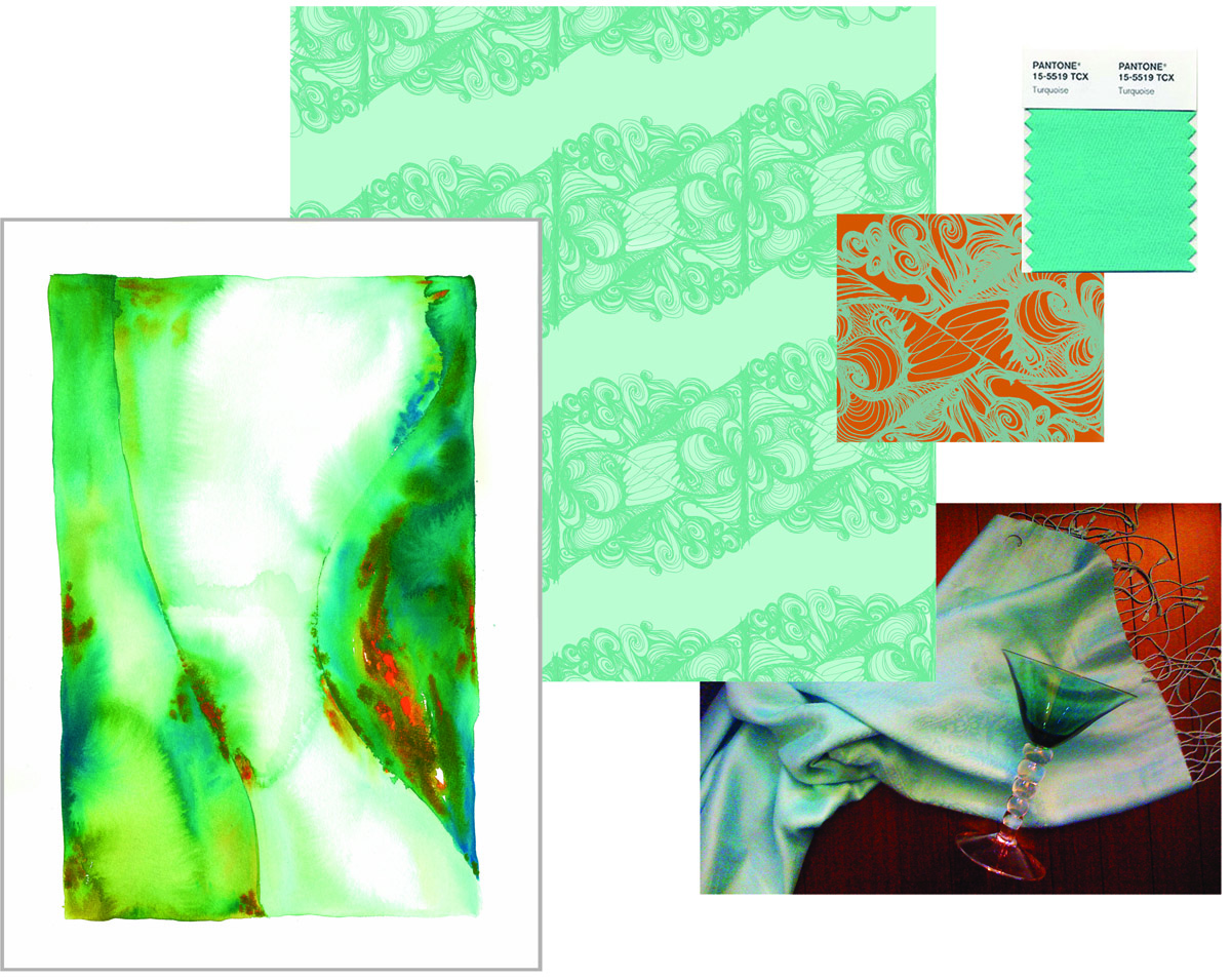
Pantone Announces Turquoise 2010 Color of the Year

Hmmm, not sure how I feel about this.

If you know me at all, you know I have embraced turquoise for a good 5 years now. My house is decorated around turquoise, I have a wardrobe full of the color. I spent well over a year of my life creating a series of watercolors based in aquas, blues and greens. And a line of textiles. (see both above). In fact, my next post will feature my Christmas card which I designed and created using, yes, turquoise!

So I am glad turquoise is having it's day. Let's celebrate turquoise!

Then, what's my problem? I guess I am just ready to move on. Maybe not leave turquoise behind, but I am ready for a new master. Maybe apple green, maybe a cornflower blue, paired with a cooler charcoal, instead of the warm brown.

Stay posted, I think I have just been inspired for a New Year's post on Cathy's Color of the Year.

For more info on Pantone and the 2010 Color of the Year go to www.pantone.com

Wednesday, November 18, 2009

Creative Opportunity Came Knocking...

I entered another contest with Veer. It kind of makes me chuckle, because I don't usually take the time to enter contests. But the creative opportunity presented itself, I was between projects and I...was inspired to jump in.

The challenge: Step away from the computer and create the Veer logo out of things in the real world. Take a picture of your creation.

How I did it: Once I had an idea I liked, I treated my entry as I would any photo assignment, except in this case I was the Art Director, the stylist, the photographer, and the photographer's assistant. I did a lighting test the day before to figure out the time of day that would work best for candlelight. The day of, I searched for props at the park and found just the right mix of orange, red, and yellow leaves. (wondered what my husband would say when he learned I had just brought a garbage bag full of leaves INTO our yard.) I also picked up 1
00 votive candles and pre-lit them to prep the wicks. At 4:00, I set up the shot. Then at 4:45, amid a sprinkling of rain, I got up on the ladder, and I shot for an hour, until it was dark out. All that was left was to narrow down the shots to the best selection and I was done.

I did not win the contest. But I did have a few days of inspiration and fun, just when I needed it. There were 726 entries, with some really cool ideas which you can view at Veer's The Skinny. (Mine is slide 126 in the gallery.)

Tuesday, November 17, 2009

Yes, I love type!

is for Daily Drop Cap, a project created by type lover Jessica Hische. She offers up these, and more, original initial caps for "your enjoyment and for the beautification of blog posts everywhere." That's what I call generous. Thanks, Jessica! And thanks for the inspiration. (No, I am not related to Jessica, just love to share when I am inspired).
See more of the awesome alphabet at dailydropcap.com.
(Also, be sure and follow the usage rights.)
Daily Drop Cap by Jessica Hische.

Friday, October 30, 2009

Thanks, Veer!


At this time of year, all I have to do is go outside to feel inspired. But I downloaded a few color inspirations from Veer® Marketplace. It is a little unpredictable to have a pink in a fall palette, but that's where the image on the left took me.
These images are compliments of @VeerUpdate. They run daily contests on Twitter and I was fortunate enough to win one with my sketch book page submission (11.25.08 post of this blog).