Showing posts with label home decor. Show all posts

Wednesday, September 5, 2012

Refreshing, irreverent & playful Jonathan Adler


Me having fun
close up of shower curtains

One of the high points of my family visit to NYC was stumbling upon the Jonathan Adler store in SOHO. While the rest of the gang loitered out on the street, I wandered through the den of original design, chic decor, and pure playfulness that is Jonathan Adler. This guy does not take it all too seriously, which is what attracts me to his design. Even the sales help has a little fun. Chas let me set up a photo shoot on his wrapping table. And he even surprised me by gift wrapping one of the mugs I purchased even though he knew it was "from me to me". 

Always loved Jonathan's design, and after getting the full treatment of his brand ID, love him even more. It isn't brain surgery, so why not have some fun? My favorite line is "your 24-hour pot dealer".

Thursday, May 10, 2012

Remember Ceramics Class?

Even when I am on vacation, or maybe especially when I am on vacation I am distracted by beautiful things that I need to capture and share. My niece, Maddy, age 17, created these coasters in ceramics class for the family beach house. I am so charmed by the patterns she created.

Thursday, September 15, 2011

Thanks for the inspiration Eileen Kathryn Boyd & Duralee Fabrics!

I keep seeing this ad. I loved it the first time and it keeps stopping me, so I finally clipped it and pinned it up on my wall. The color combinations and the design of the textiles are gorgeous. Thanks for the inspiration Eileen Kathryn Boyd and Duralee!
http://eileenkathrynboyd.blogspot.com

Wednesday, December 16, 2009

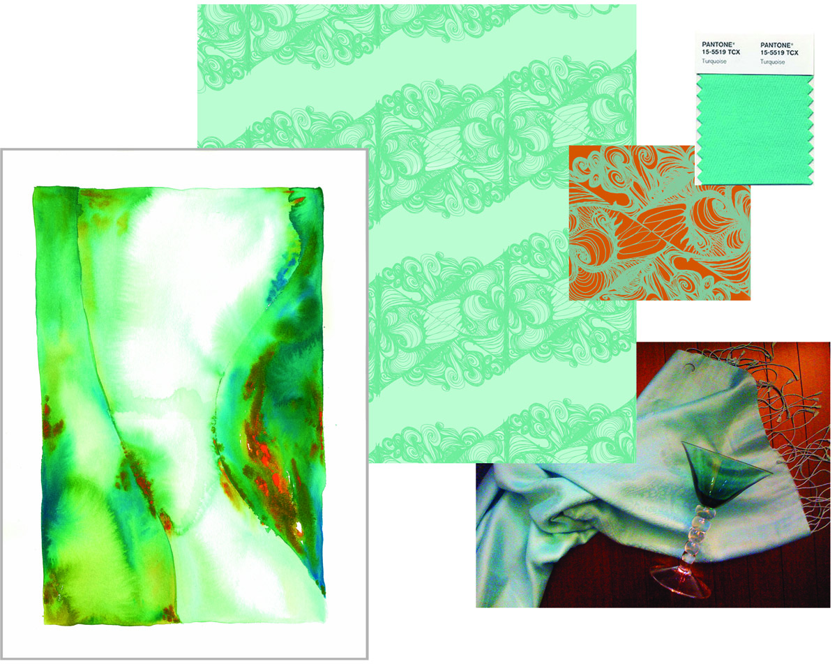
Pantone Announces Turquoise 2010 Color of the Year

Hmmm, not sure how I feel about this.

If you know me at all, you know I have embraced turquoise for a good 5 years now. My house is decorated around turquoise, I have a wardrobe full of the color. I spent well over a year of my life creating a series of watercolors based in aquas, blues and greens. And a line of textiles. (see both above). In fact, my next post will feature my Christmas card which I designed and created using, yes, turquoise!

So I am glad turquoise is having it's day. Let's celebrate turquoise!

Then, what's my problem? I guess I am just ready to move on. Maybe not leave turquoise behind, but I am ready for a new master. Maybe apple green, maybe a cornflower blue, paired with a cooler charcoal, instead of the warm brown.

Stay posted, I think I have just been inspired for a New Year's post on Cathy's Color of the Year.

For more info on Pantone and the 2010 Color of the Year go to www.pantone.com

Tuesday, June 16, 2009

It only looks like the real thing.


Ok, NOOoooww I am loving this campaign. Don't get me wrong. I loved it when I first saw the James Dean ad, and the Louis Armstrong, and, of course, the Lucille Ball?...forget about it. Very well done, on strategy and excellent execution. But the Gilda, well, now you've got me. It's that emotional connection that makes a great ad. Maybe it's because she is from my era. (are you shooting a little younger, Armstrong?) Maybe it's because I love the colors, or her spirit, but whatever it is, it speaks to me. This one goes on my wall.

www.armstrong.com