Showing posts with label color palette. Show all posts

Monday, January 21, 2013

Pantone Color of the Year 2013: Emerald Green


I was not surprised to see this green as Pantone Color of the Year. I feel like versions of it have been appearing on my radar for a while now. I have been playing with different ways to use Emerald 2013. One of the things I love about this color is its versatility. It can be the hero of a palette or a great grounding color for some brighter companions. The blueish-green version, almost a teal, is where I see this color going in the next couple years. I was shopping in Target and just could not resist these towels. Brave of them to mix the yellow-green with the teal, but I think it works beautifully.

Thursday, November 24, 2011

Ahhh, The Colors & Textures of Venice

Late afternoon light on the Grand Canal
My sister-in-law, Annie.
"Everyone looks more glamorous with Venice in the background."
Venice made me feel like I was a photographer...with my point & shoot.


I just returned from Italy and I am newly inspired! What a beautiful place. It will take more than one post to cover even the highlights, but I am starting where the trip started, in Venice. What I loved most about Venice was all the ancient, weathered walls and window shutters in beautiful, muted colors and textures. The pinks, corals, ochres and earthy grays and browns have me inspired to start a new series of watercolors. 

Collage of texture and the start of a new palette.

My favorite photo of Venice.
Residents chat with their pull cart of market purchases
 on this side street off Via Garibaldi.

Saturday, October 8, 2011

Playing with the leaves.


I am never sure where an inspiration is going to take me. Collecting these leaves on my walk started me playing with different backgrounds to capture them on. Then, I thought a little bit about whether I might do a painting based on the photo. And, I also dug into a little color palette play.
Sometimes these meanderings of mine result in a creative project. And sometimes...it's just another day of play...

Thursday, April 7, 2011

"Remember to take your daily dose of color."

Port Authority, New York


Eating healthy and embracing color –  two of my favorite things! New York social sculpture artist, Tattfoo Tan, has combined the two with his NMS: Nature Matching System to create awareness and encourage us to eat our fruits and vegetables.

I love this and what it represents. Read more about the art, the project, the murals at tattfoo.com


Placemat
Grocery Store Stickers

Sunday, January 2, 2011

2011 Color of the Year

I am not yet tired of apple green. I loved it all last year (see 2010 Color of The Year), and it looks like it will carry over to 2011 as my favorite. My husband said no way to apple green walls in our family room. But somehow, he was OK with the two full-length, GREEN sofas I just ordered! I am committed to this color!
The fabric swatch is shown here with some throw-pillow options.

Wednesday, December 29, 2010

Wear your true colors.


I love the new bracelet I received from my girfriend/sister-in-law. She knows me so well. I have been wearing it every day as I work at my desk, and it really gets me in a great mood. It is like a painting with all my favorite colors.

Monday, February 22, 2010

Transmoflection. Vancouver 2010 Graphic Identity.

Transmoflection. Transformation, fusion, motion, reflection, connection....these are the words used to describe the essence of the Vancouver 2010 Graphic Identity. I have been enjoying the backdrops at the events, the green, blue shapes, swirls and textures that are the core graphics and a visual part of each event. The process they used to get there seems intuitive, yet smart. I love the end result. Very unified. Strong identity, which of course is the point, but not something that has stood out to me in past Olympics.
Watch the design team talk about how they got there.

Monday, February 1, 2010

My studio feels white, fresh and ready for what's next.


I like to be surrounded by things I love. Every wall in my studio gets covered with bits and pieces of inspiration that I collect along the way. It becomes a collage of color, type, quotes, messages, trends and things I feel I need to capture, before they slip away. In fact, it was the inspiration for this blog. To share the things draw me in, move me forward, or just make me happy. But, every once in a while, it's time to clean house. So today, I took down my wall. My studio feels white, fresh and ready for what's next.

Some of the things that showed up recently...

loose, hand-drawn patterns...

pinks...

deep plums and dark grays...

artwork featuring words...

organic shapes...


neutral color palettes...

birds...

I have a huge sketchbook I keep, a sort of visual log, into which some of these trends will get taped and saved for future reference.

Monday, January 25, 2010

Cathy's 2010 Color of the Year: Green

Green has been showing up a lot in my choices lately. A new scarf, a handbag. It is the warmer, yellow greens and ochers that are catching my eye. Thinking about painting the family room green - an olive green, paired with charcoal gray, or deep brown, so that the green almost becomes a neutral.

I also like a brighter apple green as an accent, in accessorizing that businessy-black suit. Or mixed with ochers, or plum, or turquoise.


Source:
Handbag:
Fossil from Zappos


Earrings:
AestheticsAndOldLace on Etsy


Bedroom: Ikea

Watercolors: Cathy Hunt

Wednesday, December 16, 2009

Pantone Announces Turquoise 2010 Color of the Year

Hmmm, not sure how I feel about this.

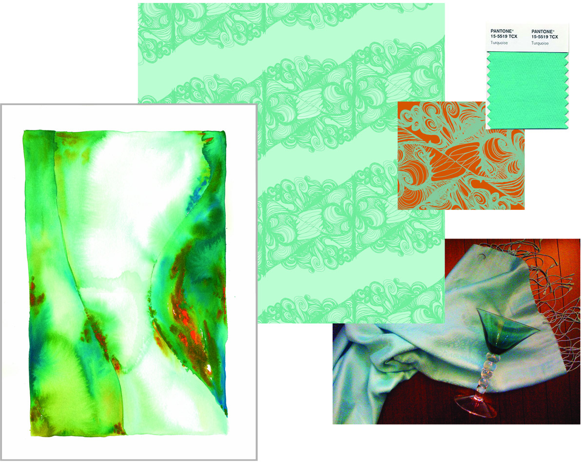
If you know me at all, you know I have embraced turquoise for a good 5 years now. My house is decorated around turquoise, I have a wardrobe full of the color. I spent well over a year of my life creating a series of watercolors based in aquas, blues and greens. And a line of textiles. (see both above). In fact, my next post will feature my Christmas card which I designed and created using, yes, turquoise!

So I am glad turquoise is having it's day. Let's celebrate turquoise!

Then, what's my problem? I guess I am just ready to move on. Maybe not leave turquoise behind, but I am ready for a new master. Maybe apple green, maybe a cornflower blue, paired with a cooler charcoal, instead of the warm brown.

Stay posted, I think I have just been inspired for a New Year's post on Cathy's Color of the Year.

For more info on Pantone and the 2010 Color of the Year go to www.pantone.com

Friday, October 30, 2009

Thanks, Veer!


At this time of year, all I have to do is go outside to feel inspired. But I downloaded a few color inspirations from Veer® Marketplace. It is a little unpredictable to have a pink in a fall palette, but that's where the image on the left took me.
These images are compliments of @VeerUpdate. They run daily contests on Twitter and I was fortunate enough to win one with my sketch book page submission (11.25.08 post of this blog).


Friday, April 3, 2009

color and shapes along the way


Just a few things that caught my eye. I have a thing for leaves, but don't often see them on the beach. And I couldn't pass by this inspiration for a color palette.

Thursday, February 5, 2009

Restraint.

I just saw Benjamin Buttons and it was worth it just for the art direction alone. The desaturated look throughout is so rich, and yet so restrained. I could count the times a bright rich red showed up against the deep greens and browns. The steel blue, night-time, water scenes were gorgeous. I think one of the hardest things to do in any kind of art is to have restraint. To keep the color and tone of the art narrowly defined, powerful in its subtlety. I loved the unique texture this palette added to this unique story.

Style Board #147


Creating a visual tone is a big part of what I do as a designer, and creating a style board is one of my favorite ways to present a "look". This particular one is pretty polished, but really anything goes with style boards.
I have been working on a lot of health care lately, it seems to be one of the industries that is continuing its marketing efforts in this economy. Creating a look that is not too clinical, and also does not look like other players in the industry is a challenge. Great imagery always helps.

Thursday, November 6, 2008

there's something about a leaf


I picked up a handful on my walk today. Too bad they don't last more than a day.

Tuesday, October 21, 2008

Inspired by jewelry


I fell in love with this ring, which has some of my favorite colors...the palette I created uses a less "orangey-orange", which works better for use in printed materials.